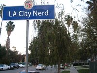
 So, someone finally got a better picture than mine...
 Back on May 2, 2006, I came across these signs at Western & Olympic and at Wilshire and Olympic. Why did we need new ones, I thought? What was wrong with those we had?
I talked to some folks in LADOT, and couldn't get an answer. I took a picture of them at the time I was able to (dusk), but they didn't help much. So, no answer. (By the way, the picture of Wilshire here is from the Franklin Avenue Nerds.)
Then, Mike came along today with this post. I sent the photos to an engineer, and got the following info:
"[LADOT] only uses fonts per the standards laid out in the MUTCD (Manual of Uniform Traffic Control Devices). It basically states that as long as it's within certain guidelines, then it's up to the discretion of the [installing] agency. In this case, [LADOT] management just decided that it's a good idea to 'dot' the 'i''s. There's not much to it - it's just a matter of preference."
And in terms of the MUTCD, it says of street name signs:
"Guidance:
Word messages should be as brief as possible and the lettering should be large enough to provide the necessary legibility distance. A minimum specific ratio, such as 25 mm (1 in) of letter height per 12 m (40 ft) of legibility distance, should be used.
Support:
Some research indicates that a ratio of 25 mm (1 in) of letter height per 10 m (33 ft) of legibility distance could be beneficial."
All it does is offer guidance in terms of size and clarity. And don't even start on color - that too is only a suggestion from the State. (The code specifies a different color scheme than we use in LA City.)
So, the new font is... whatever the DOT signage czars want it to be!
And that czar: John Fisher, Assistant General Manager and one of the leading signage experts in the State. He may be the one to answer the question as to what font it is. I didn't ask him, but you could: john.fisher@lacity.org.

4 comments:
This sign indeed represents a departure. First installed in 1975, these overhead signs have seen minimal change since then. Replacements since the mid-1990s seem to be in a slightly deeper blue and in a VERY slightly narrower font. Newer signs also give entire street names (e.g., "Wilshire Bl" instead of "Wilshire"). But, it's true, this is unusual--to me, just a little less elegant.
Street signs need to be improved in the city especially during daytime at certain parts of the city. I am perfectly-sighted but in places like the Valley, street signs become impossible to read from a reasonable distance if you are looking at them at the same direction as the sun. Signs should be reflective enough to be both bright at night and day.
These changes are in addition to the new "No Parking" signs being put up around town with the P with a slash through it instead of the words written out with "NO" in a red box. I don't have a photo of them right now. If LA is going to make a change, they need to be consistent (think of Metro, for instance).
Always wondered about this. Thanks!
Post a Comment